
10 Timeless Home Decor Trends of 2019
When designing what your home will look like, it can be a confusing web of trends and timeless design. Maybe you’re getting your ideas on Pinterest or in magazines. But it can still be hard to know what is a lasting trend and what goes with the season. Well, we put together 10 timeless trends to use in your home in 2019 that will last.
1. Mixing Neutrals
Princess Diana was the queen of mixing neutrals. In fact, she had a whole list of rules of which neutrals went together and which didn’t. It just so happens, she was also the queen of timeless fashion and design. But you are looking for home design tips. That’s the thing about art and design, you can get your inspiration from anywhere.
When mixing neutrals, think of the color wheel. Also, think of the underlying hue of the neutral. There is very few neutral black or white. There are no neutral browns. Greys also have an under hue. Remember learning warm versus cool colors in elementary school? If not, think of what something hot may look like compared to something cold.
Here are some examples of mixing neutrals below. For the sake of examples, we are using the home decor rule that dark blue counts as a neutral.
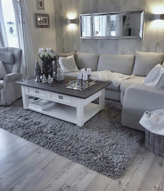
Take this room for example. Notice how they have mixed a number of cool greys. It is a very monochromatic scheme. With the smooth lines and varying textures, this is a very timeless room. There are no colors, shapes or patterns that will go out of style. This is a living room you could love in the 1960s and a living room you could love now.

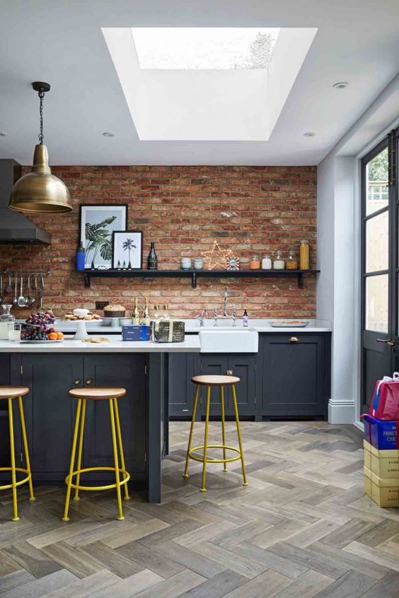
This kitchen mixes black, white and gold. Playing with metal textures is a fun way to make a neutral color scheme pop. You can see the silver mirror in the background of the top image. Adding some shine will keep your neutral mixing from getting flat so if you are not looking for that flat look, avoid matte finishes on paints, furniture, and decor.
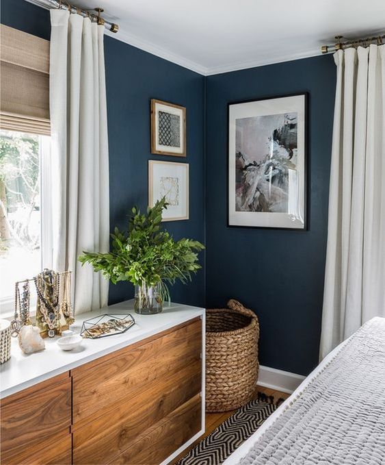
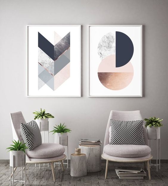
This is my favorite example of mixing neutrals. Notice how the dark blue really pops against the warmth of the wood on the drawer of the dresser? This is compliment under hues working together to make a powerful room. Remember the color wheel I mentioned earlier? Well, if you take a look back at it you will see that orange and blue are opposite. That means they will make each other brighter – like a best friend or a soul mate. But be wary to not mix compliments with too many other colors. Notice how this room uses the soulmate colors but pairs them with white.
2. Pop of Color
A pop of color is a classic way to easily add style to your space. This design trend has its roots in the Bauhaus/Minimalism movement of modern art. Smartly mixing neutrals with something that pops has been a hot “trend” for decades. Again, this is where the color wheel comes in handy. Look at where colors lay on the color wheel to make sure you are pairing colors that will work together rather than fight for the eye’s attention. This is also where we can use the rules of neutral we discussed early. Here are some examples of pops of color.

This small chair makes for a great focal point in this living room. You can see they are using all neutrals (brown, white and grey) to make the chair that one fine item in the room. With the classic colors, natural textures and neutrals, this is a great example of a timeless living room.

Who remembers the fun colors of the ’60s and ’70s? Depending on your age, you probably saw a couch a lot like this in your childhood home or your grandparent’s home. Well, guess what. They are back. And that’s great! Sofas can be a great way to add that pop of color in a timeless way. Make everything around the couch have a modern or post-modern (think 1950s vintage) style and you are well on your way to the most classic of living rooms.
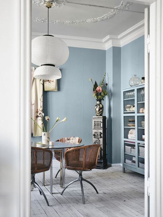
Here we are seeing that blue and wood repeat it’s self in a more subtle way. Also, noticed how it is paired with white again. Don’t be afraid of white. It is our best friend in the design world. Technically, when we are looking at color in the 3D world white is the absence of color. White bounces the light of all colors back into the eye of the viewer.
3. Natural Elements
A huge trend happening right now among new homeowners if the inclusion of natural elements such as wood floors, plants in every corner and exposed stone walls. Bringing an element of nature into your home is an extremely safe way to add a classic touch of texture or color. It is also relaxing and homey.

You can see this living room actually has a lot of natural textures and colors happening. So we have the green of the plants, the light brown/orange of the wood floor, the woven baskets, and the fur. The shelf on which the plants on the wall if also wood. This living room is very subdued, making the plants the focal point. But this a fun, timeless way to bring plants and natural textures into your home.
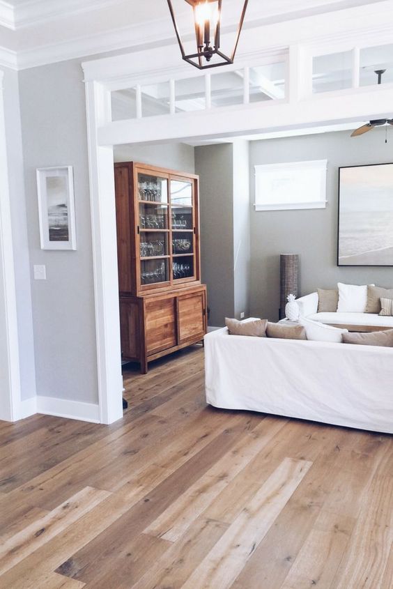
You can see this home is using wood floors and wood decor pieces to add a very subtle touch of nature. You can never go wrong with high-quality wood floors and decor pieces.
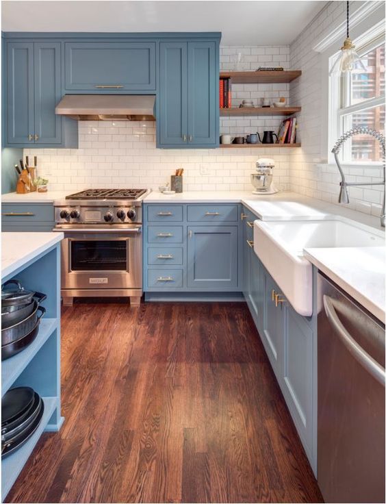
Now here we have a more eclectic way to bring natural textures and elements into the home. We have a wood floor that is playing with colors and textures that works with a brick wall. There is a fun use of color to pop against the mixed neutrals of the floor, wall and cabinets.
4. Stone
I know stone is a natural element but I wanted to talk about just stone on its own since it can vary in shape, color, and texture. Stone can be a shiny, expensive, focal piece or a neutral wall. Since stone varies so much, here are some examples of using stone as home decor.
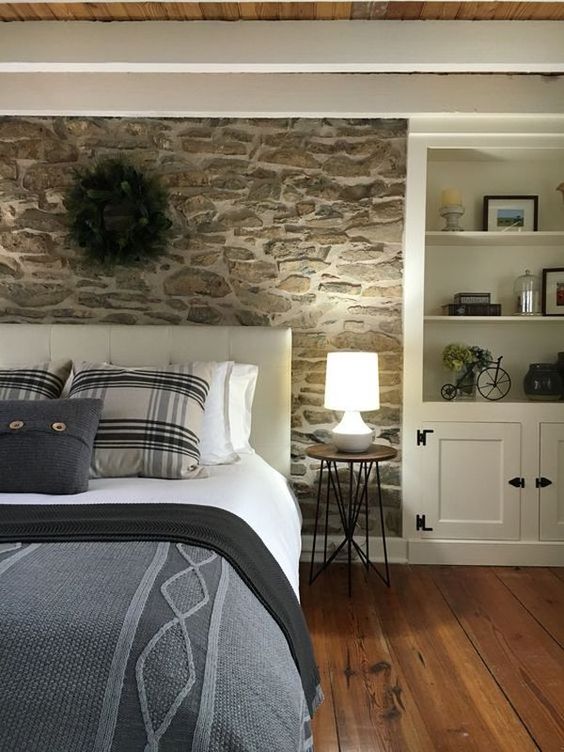
Look at how warm and cozy this bedroom feels. The stone wall behind the bed adds visual interest as well as a calming color palette.

“Where is the stone in this picture, crazy lady?” is probably what you’re asking me right now. Well, no fear there is stone here (rhyme unintended). Look at the stone top for the coffee table. It is a very simple and timeless way to add a natural but shiny texture to your home.
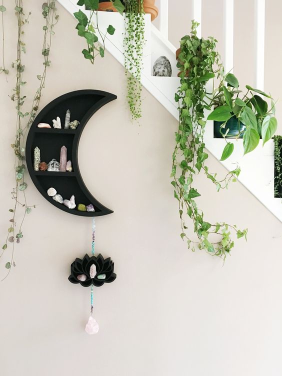
And here we have stones being used for tiny decor, collector pieces. This is a fun way to get a new hobby but also adding something different to your home that very few people have. Plus, you can show off your “healing crystals” when your friends come over for a wine night.
5. Simplicity
Simplicity is key if you are over your head with design choices for your new home. Just think simple. What is the least I can have in this room to have it function? What are the smoothest lines and simplest furniture I could have? Poof. Now your home looks like it was designed by a professional but really, you were just taking it easy. Simplicity goes with every color, every shape and every texture.
And you’re in luck. The last 2010s have seen a rebirth of Bauhaus (simplicity) and minimalism trends in the home for there are plenty of pieces you can find online that are very simple. Here are some examples of minimalism as home decor.
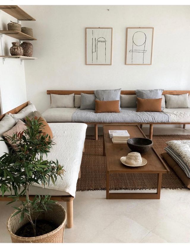
Look at all of these mixture neutrals and natural elements. It’s almost like I know what I am blogging about. Rare today, I know. Notice how the coffee table and sofas are just simple shapes. Notice all of the use of whites. Notice how this is the easiest thing to put together for the over-whelmed or lazy home decorator. You’re welcome.

Oh my gosh. More white. Are you seeing a trend here? Even the bar stools are the minimal shapes they can be to function as a barstool. And that is what Bauhaus is all about. Tell your friends that at your next cocktail party. They will think you’re all cultured.

Look at even the simplicity of the window. Now, you’ll notice there is no dresser. Minimalism isn’t for everyone. It is a lot of not acquiring stuff. If you are a nick-nacky person, you may want to look at more post-modern homes for a fun, vintage touch.
6. Geometric
This is debated in the design world because using geometric shapes in very modern. But modern art started during the 1860s in France so not only can we call it “timeless” now, but we can also consider it worldly. Think back to elementary school shapes. This does not even have to be high school or middle school geometry. Just shapes.

Here we have white and natural elements again. But if you notice the hexagon shelves in the background, you can see how shapes has been used to add more style to this living room.
The geometry in this room is in the art. Again, you are working with simplicity and minimalism but they use the art as the focal point of the room. If you are looking for some fun art that will add some style to a room in your house, try local craft fairs or Etsy to find artists who understand color, shape, and texture. Buying at Walmart and Target for this one simply will not do. Not if you want timeless art, anyway.
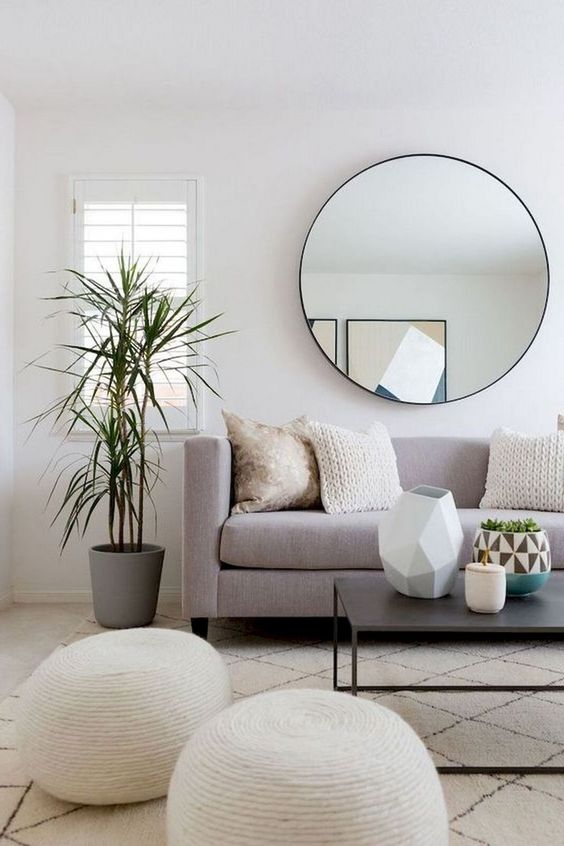
See how they used a huge circle mirror for a focal point here. They are mixing neutrals, textures, and shapes to get a clean, timeless look. That’s the thing about timeless design: circles, squares, and triangles will never change. Leaves and nature will always be green and brown. The ocean will theoretically always be blue (as long as the sky is blue). White will always be the absence of color and black will always absorb all light and color. When you stick to these Design 101 rules, you can’t go wrong.
7. Symmetry
Symmetry is natural to us. Right away, humans can recognize symmetry in each other and our surroundings. Even if you don’t know what symmetry is. Using symmetry or a-symmetry in your home in an intentional way will make your home so beautiful and the envy of all of your friends. In simple terms, symmetry just means balance. Asymmetry means unbalanced. If you are not an experienced designer, symmetry is easy. It’s just putting the same shape, size or color opposite of each other. Like if you were balancing scales.

8. Vintage Finds
I know, I know. If vintage finds are timeless than why are they vintage? Well, as I have learned being an adult, vintage is a very malleable word. The general rule of thumb is this: antiques are 100+ years old and vintage things are 20+ years old. So technically the Gameboy color I got for Christmas in 1993 is vintage. But the nick nacks your grandma had in her home are also vintage. So it’s all about keeping up with whats vintage. Think what nostalgia means to you or your kids if they are reaching into their late teens to their early 20s. Listen, vintage is a fine line. But you can make it timeless if you are willing to go a bit eclectic. You can even be minimal but eclectic. Remember that minimal is just about having the bare minimum. Stay light on the vintage and heavy on the timeless trends like mixing neutrals.

Let me ease you into this vintage thing. That’s right. Farmhouse chic can be considered vintage. My favorite thing about vintage pieces like this is they are relatively affordable. If you Google Search vintage and thrift stores around you, you can find some amazing finds that won’t break the bank.
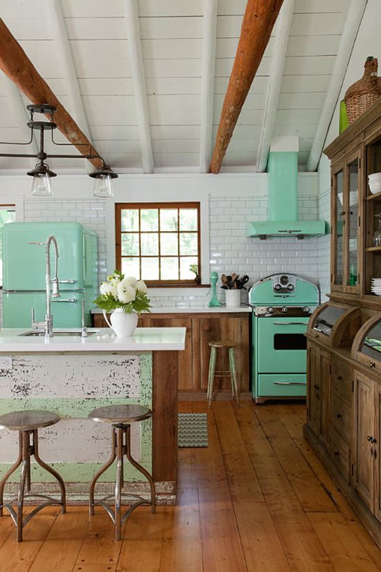
Okay! Now that you are hooked, look at this way in incorporate vintage. We have pops of color, mixing neutrals and natural elements but that vintage feel of the appliances adds some fun!
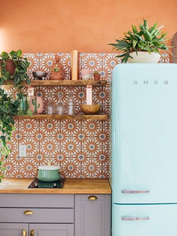
Tile is my favorite way to add vintage or eclectic prints to a home. They bring in color, texture and visual interest. Plus if you buy them right from the manufacterer, you can save some money.
9. Simple Patterns
That tile tidbit leads me here, to patterns. Patterns can be neutral and minimal or eclectic and fun (like the one above). Using patterns can add some visual interest as well as a style. So let’s say you did the whole living room with a neutral wall and wood floors. How do you spice up that room in a timeless way? Patterns! Maybe you get a boho couch or a tile coffee table. Now you are working with a style but also keeping things simple. See how easy home decor can be?!

The easiest way to add a pattern to a room is a rug. Rugs can be the focal point of totally blend with the room. Rugs are everywhere. You can find boho styles at World Market or something more simple at Target. You can even find affordable rugs at Home Depot. Just look at their carpet remnants section.
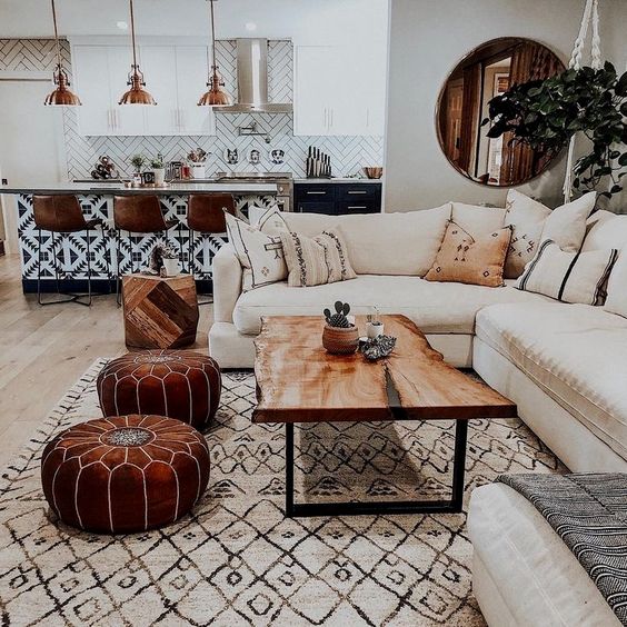
Yes, there is a patterned rug here but look at the tile on the breakfast bar in the background. Did I not tell you tile is a great way to add visual interest? I told you, I know what I am talking about. Look at the way that tile adds a boho touch to a minimal, maybe boring, living space.
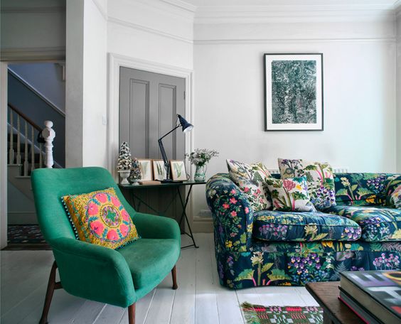
Okay, you know I like to pop my eclectic style at the end. I wanted to easy you into patterns before I showed you this and lost all my design street cred. I love this couch. I love this pillow. But this is just an example. Finding couched with bold patterns us a fun way to add visual interest to your home!
10. Cool Colors
It’s not that warm colors aren’t timeless. It’s just that cool colors have a very calming effect. So if you are looking for a home with some seriously chill vibes, cool colors are the way to go. And that’s not to say you cannot mix warm colors in woods, leathers, and home decor. But I am saying that your walls should really be a cool color. Maybe I am biased as someone who had a yellow bedroom for too long but I also went to art school three times (I graduated every time, fyi). Cool colors are the color of the ocean and sky. Warm colors are stop signs and poisonous animals. Cools colors just natural work with our psychology.
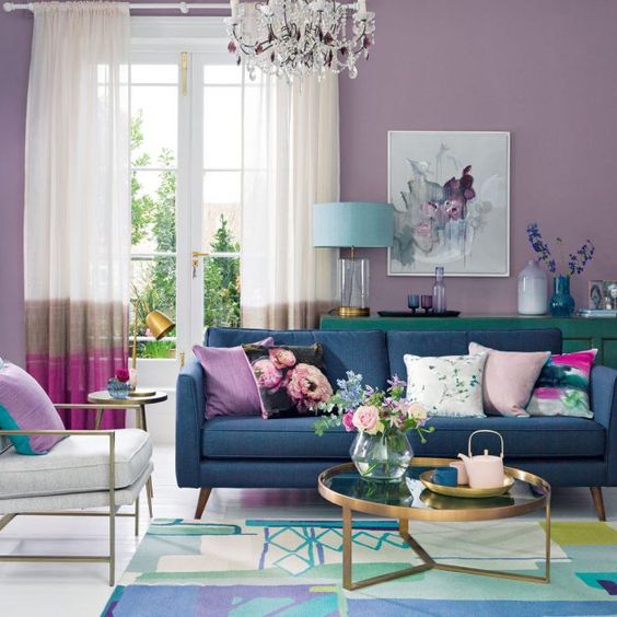
I don’t need to add any pictures here because I have been subtly filling your brain with this idea from the beginning. Not on purpose. Just in the way that cool colors are naturally what designers go to when making a chill and timeless home. So go ahead and look back at the color of the walls in the pictures above. Yes, you see a lot of white but there is also a good amount of blue. You can also see a lot of green and purple in the pictures above. Blue is the color of calm, green is the color of nature and purple is a daring cool color that is associated with elegance. I will put some examples below of ways to use cool colors just so you have more examples to bring to your home builder, professional designer or significant other.

Conclusion
Are you less over-whelmed by the task of decorating your home now? It really is simple. Literally. Start with minimalism and add pops of your own style! You can use things like pattern, shapes, and texture to liven things up. Look around for inspiration at art museums, fashion shows and more. Walk around a vintage store or World Market and find that one item you can design a room around. Or maybe you found a tile you really love but you weren’t sure how to make it work. Neutrals and natural elements can work with that tile. Now, go forth and make something cool!